2 Week Sprint
Identity design | Conceptual strategy | Copy
Conceptual case study. KORE is a fictional brand
KORE is an API that acts as a middle-layer ledger between banks and payment processors. Traditional ledgers don’t speak the same language, creating entropy and requiring countless man-hours to verify transactions. KORE removes this friction by acting as a universal translator, reducing errors and operational risk, keeping transactions flowing and stable.
The emotional outcome of this stability is relief.
Conceptually, KORE is an unbreakable, heavy box. In an environment where decision-makers operate under constant risk of failure, audits, and incidents, Kore is reliable, secure, and intentionally “boring”. It removes the “excitement” (volatility) from day-to-day fintech transactions, replacing it with predictability and control.
This is “freedom to breathe”.
The identity was designed to mirror KORE’s sales cycle. Adoption begins with a developer’s rational, technical evaluation and concludes with executive approval. What starts as a cognitive, outcome-driven purchase decision resolves into an emotional payoff: reduced vigilance, fewer incidents, and the ability to step back and trust the system.
Challenge:
Create a system that speaks to two targets in the sales pipeline
Cummunicate trust and stability
The logo is a representation of the API’s core function: a verified piece of data (the signal) emerging from an immutable ledger (the box).
I chosed to visualize this specific moment because KORE’s customers base their decisions on predictability and outcome. The geometry is intentionally heavy and sharp to reflect the stability and strudiness of the infrastructure, positioning the brand as the antidote to the volatility of fintech transactions. Directly addressing the problems KORE is designed to solve.
The uppercase wordmark is a deliberate point of visual differentiation within the category, chosen to reinforce KORE’s position as infrastructure rather than interface.
Forms were kept simple and repeatable to support long-term scalability and prevent stylistic drift as the system expands.”
The brand voice is direct and outcome-focused. I prioritized clear affirmations over persuasive language, mirroring KORE’s role as a neutral source of truth in the fintech ecosystem.
This approach is designed for an audience making rational, high-stakes purchasing decisions, where trust is established through clarity rather than persuasion. System metrics are treated as part of the language itself because expressing uptime, verification, and transaction integrity act as evidence of KORE’s promise. This proof is what enables the emotional outcome KORE ultimately delivers: the ability to relax, to trust the system, and to breathe.
I organized typography by function instead of traditional hierarchy. This creates a clear visual distinction between Human Interpretation and Machine Output, allowing the brand to speak fluent ‘Developer’ while remaining accessible to the C-Suite. Reflecting the dual audience involved in KORE’s customer journey.
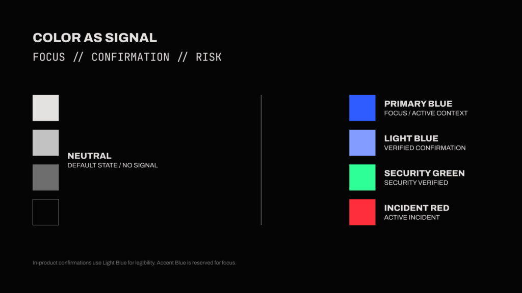
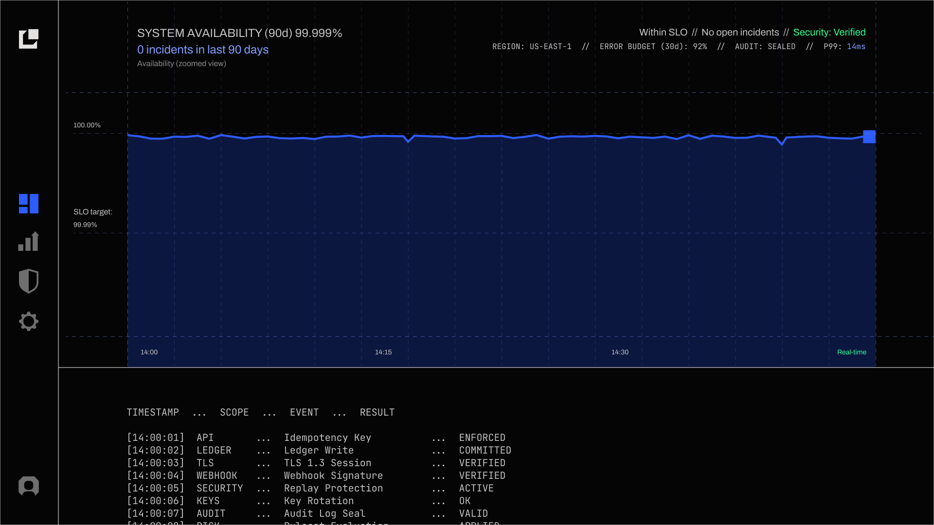
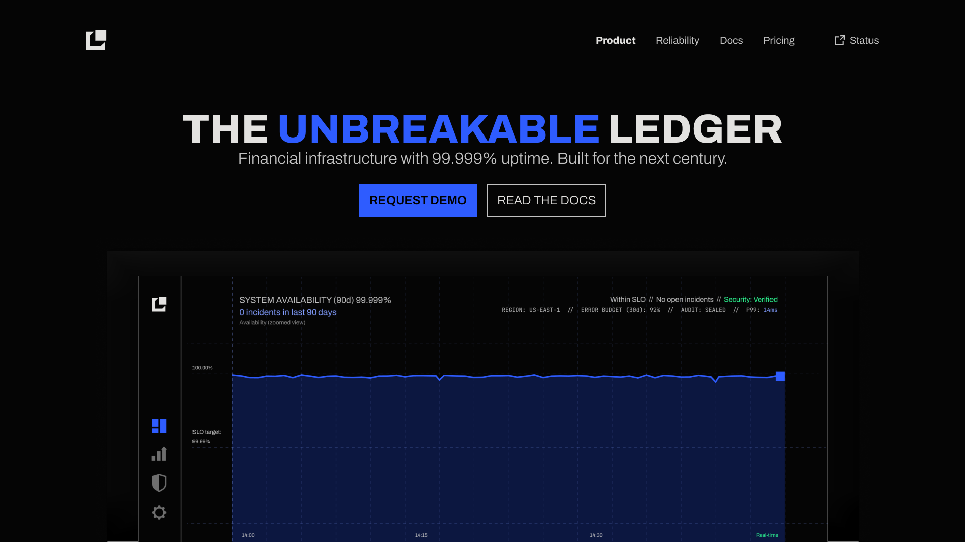
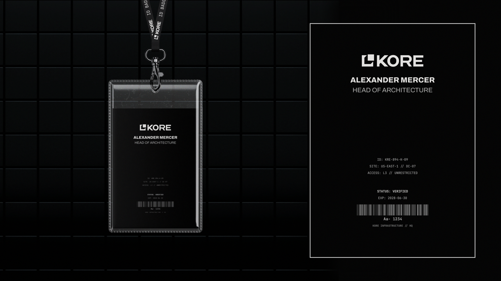
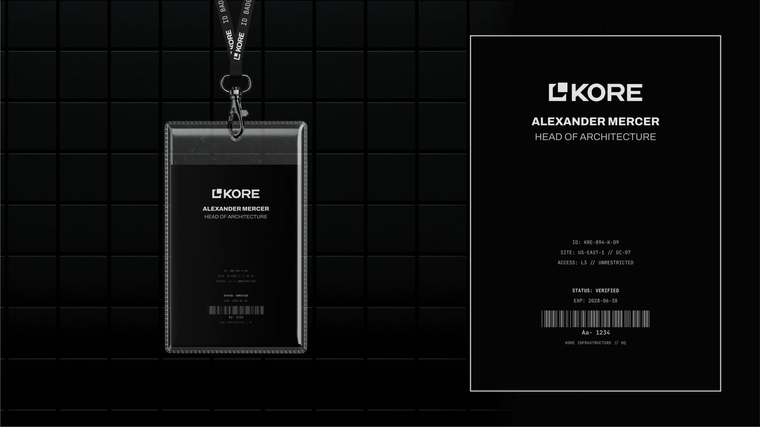
In critical infrastructure, color cannot be aesthetic; it must be informative. KORE treats color as a strict signaling mechanism, structured around two layers: The Environment and The Signal.
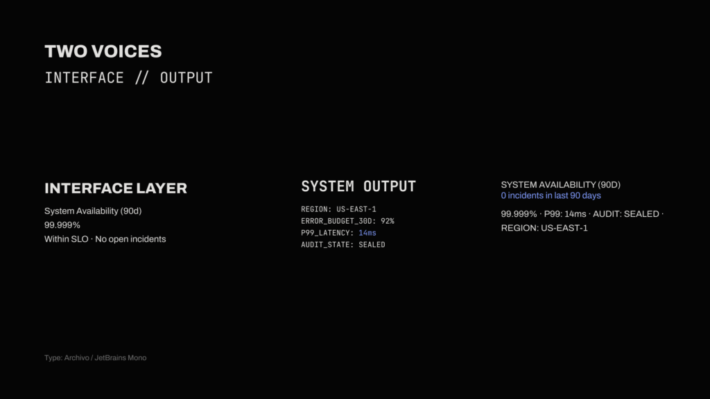
The Environment establishes visual silence. The interface defaults to deep blacks and neutral greys to minimize cognitive load during prolonged use. A calibrated dark theme reduces eye strain in low-light developer environments, while pure white is intentionally avoided to reduce glare and bloom that can soften edges and hurt readability. Headlines use high-contrast off-white, with body copy set in light grey to maintain a calm, controlled reading experience.
The Signal operates as a functional protocol. While Electric Blue is used for brand communication, inside the dashboard, it is repurposed strictly for active focus states. The rest of the palette is constrained to unambiguous system flags. A lighter blue is used to indicate the default, neutral operational state, present and correct, but without urgency or emphasis.
Green is reserved exclusively for verified security states, and red is used to signal risk or incident conditions.
Series A pitch concept illustrating the problem KORE solves
Operational dashboard demonstrating how KORE behaves under normal conditions.
Silence is the expected state. Color and alerts appear only when the system state changes.
Homepage interface illustrating KORE’s role as a stabilizing ledger layer, designed to make system health observable, verifiable, and boring by default
X post concepts exploring the emotional outcome, the fintech status quo, and the system that solves it.
ID badge concept applying the KORE system to physical access